CSS Grid vs Flexbox: When to Use Which
CSS Grid and Flexbox are two powerful layout systems in CSS, each with its own strengths and use cases. In this post, we'll explore the differences between them and when to use each.
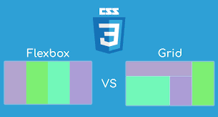
CSS Grid is designed for creating complex, two-dimensional layouts. It allows you to define rows and columns and place items precisely within the grid.
.container {
    display: grid;
    grid-template-columns: repeat(3, 1fr);
    grid-gap: 1rem;
}
Use CSS Grid when you need to create layouts with both rows and columns, such as dashboards or magazine-style layouts.
Flexbox is designed for one-dimensional layouts, either in a row or a column. It's perfect for aligning items within a container.
.container {
    display: flex;
    justify-content: space-between;
    align-items: center;
}
Use Flexbox when you need to align items in a single direction, such as navigation menus or card layouts.
In many cases, you can combine Grid and Flexbox to create powerful layouts. For example, use Grid for the overall page layout and Flexbox for aligning items within grid cells.
.container {
    display: grid;
    grid-template-columns: 1fr 2fr;
}

.item {
    display: flex;
    justify-content: center;
    align-items: center;
}Both CSS Grid and Flexbox are essential tools for modern web development. By understanding their strengths and use cases, you can choose the right tool for your layout needs.